A few years ago I started developing identities for companies I felt needed a change as a hobby. As I was designing them I showed them to my family and after a few times seeing them they got so used to these new logos that when they were seeing the actual ones they got confused and asked me sometimes if they actually changed their logo or not. That's how the idea of "A Parallel World" came to life, I realized I was creating a parallel world of identities. Keep checking every once in a while to see more being added.


Previous Logo

Up and up.
7up is a Lemon-Lime carbonated drink that has known better times. There could be an opportunity to update its image to a more contemporary look.
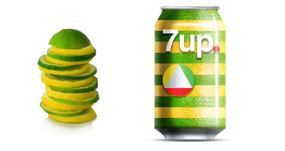
The idea is to update the iconic red dot and to integrate two slices of Lemon and Lime, to represent the main ingredients and a third red element that completes the dot, at the same time the three elements create an upwards pointing arrow, enhancing the positive "Up" message from the name.
The can is designed around a more natural look, resembling of a stack of Lemon and Lime slices.
